


The front page of your website is the external face of the company. It is therefore important that it manages to arouse interest and retain visitors. And how do you do that? Here are 5 suggestions for improving your front page.
Perhaps you think that your good product or indispensable service is enough in itself to create success. But unfortunately that is not always quite enough. You can have a good product or service, but if you have not put in the effort with your website many people will never discover how good your products and services are. The front page of your website is your chance to arouse interest and retain visitors. And it is a chance you should not miss.
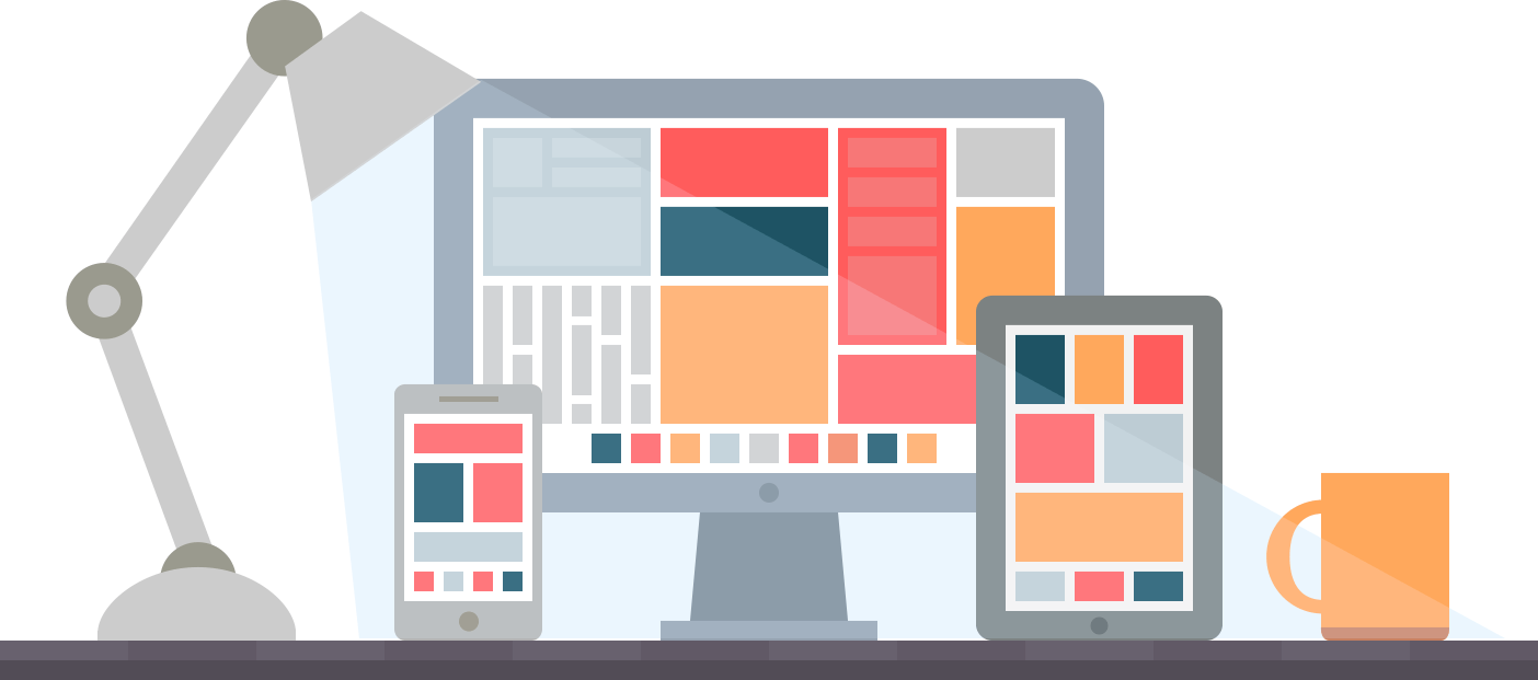
The website as a whole is the foundation for you to be able to sell and grow your business. It is on the website that you present your products and services, and it therefore constitutes the essence of your online presence. Here, the front page is your customers' first meeting with you and your opportunity to establish a good first impression. That is why it is important that your front page lives up to the three parameters: well-thought-out, complete, and brilliant.
There are several ways in which you can ensure that your website lives up to the parameters. Imagine a website where after 2 minutes on the front page you still have no idea what the company does. Does it make you want to linger? For most of us the answer is no.
Firstly, many will give up simply because of frustration at the lack or abundance of information that stands in the way of understanding the sharp message. Secondly, many will not waste time on a website that is unclear when they can easily find what they are actually looking for with a new Google search. Thirdly, some may even wonder if they even have control of their business when even the front page is a disaster.
This is precisely why your front page has an enormous influence on your visitors' experience and understanding of you, and whether the visitors are converted into customers at all.
Does it sound dangerous and like an unmanageable task? We understand that very well. Because the perfect front page is an illusion. Working with the front page will always be an ongoing process, and sometimes it will also feel like sticking a finger in the air and trying your best while blindfolded. Users' wishes and needs are changeable. And what exactly deters or keeps visitors on a website cannot be transferred to a universal recipe. Therefore, you can instead make use of among other things Growth Driven Design which is about maintaining and continuously adjusting the front page.
Nevertheless, there are some steps you can take to improve your website regardless of what your starting point may be. Below we have collected 5 good tips for a better front page for your website.
1. The Sharp Message
Many are so rooted in their own company that it can be difficult to describe in a few precise words what the company actually does. It is difficult to boil down because you have so much on your mind. And it can be difficult to put yourself in the customers' shoes and imagine what information is needed on the front page.
On the front page you must present your visitors with a sharp and concise message. There must be no doubt about what you are doing - no matter how complicated it may be. Even if you are familiar with your professional words and terms it does not mean that the rest of us understand them. Precision is the key word even if it can mean that you almost cut the message out of cardboard. But then at least you are sure that people are involved in what your company is doing. And that is the most important.
How do you make sure that your message is sharp? USPs (Unique Selling Points) and UVPs (Unique Value Proposition) are tools you can use to convey the message sharply to your visitors. They are eye-catching, clear, and convey in a few seconds exactly what you are doing. On top of that they are also good tools for improving the internal business understanding of existing and new employees.
To find out if the message is sharp enough on your front page you can as yourself the following question: Can you find out what the company does and sells in less than 5 seconds on the front page? If the answer is no or you are in doubt then you have a job ahead of you.
2. User-friendly Navigation
Once you have got a handle on how to convey the sharp message the next item on the list is to provide user-friendly navigation on the front page and your website in general. Firstly, you do this with a clear menu structure with categories which help the visitors to navigate around the page. And of course this must apply regardless of whether the visitors are on the front page or any other page.
Secondly, the front page is also an important element for creating a user-friendly experience on the site. The front page acts as the door to the rest of your website. Therefore, it must be easy to navigate from the front page and further around your subpages.
On the front page you want to tell a lot at once. And one way to make it clear and easy is to use icon boxes, images that refer to sub-points, raptor ribbons directly to products or color division to mark categories. It may be that you offer different services, or you have several departments, and you can then give them each a different color so that it creates an overview and recognizability throughout the site.
There are several ways in which you can make the front page clear, and it is particularly relevant to focus on if your business is complex or deals with a complicated subject.

3. Clear CTAs
The third suggestion is about CTAs (Call To Action). Because that is another important element on the front page. The absolute purpose of your website is for visitors to take an action. And what action it should be is up to you as long as it is clearly stated on the front page.
It may be that you want the visitors to contact you, get a quote, make a purchase, or download a demo. Whatever you want make it clear on the front page either in the form of a button or links. On the front page you can place banners with CTAs that are eye-catching. In addition you can place a CTA at the top of the menu which is always placed in the same place even when you move around the website.
It is important to have CTAs on the front page but you still have to tread carefully. The solution is not to throw around CTAs all over the website. It still needs to be well-considered and well-balanced otherwise you risk visitors giving up. Therefore, you should stick to one kind of CTA with one message and place it moderately on the front page.
The most important thing for a CTA is that you make it as visible as possible with colors and the right location. In addition it should have a text that makes the recipient want to actually click the button e.g. it might make you want to use the button with a text such as 'Contact us' or 'Get offer' rather than a button with the words 'Click here' or 'Offer' which can quickly seem commanding and bland.
One way to help yourself along the way is to ask the question: Does the front page invite an action? If not, then you are not doing your visitors or your business a favor.

4. Build Authority
The competition is fierce in 2023 as well. Customers have many choices and with a Google search they can easily find what they are looking for. And here it is about giving yourself the best foundation for customers to choose your website over the competitor.
Authority can be what makes the difference for the customer. Here are different ways you can build authority on your front page:
- Build authority with customer testimonial where customers or business partners comment on the experience at your company.
- You can highlight relevant facts on the front page such as "More than 6000 satisfied customers" or "100 employees to help you" - there are many options. But remember: Users are critical like never before so they will see through quickly if you are not telling the truth.
- Make use of data from e.g. Trustpilot where visitors can see different reviews.
- Present your business partners e.g. with a logo banner where visitors can see who you negotiate and collaborate with. In this way you can borrow authority from other which strengthens your credibility.
It can be an unmanageable and unsafe task then the customer has to make a choice between you and the competitors. And it can be about whimsical things when the choice has to be made. Therefore, you should already on the front page build authority and credibility so that they feel safe in choosing your company.

5. Considered Content
The final tip for improving your front page is one that should actually be used in general in all communications your visitors encounter on your site. And we would dare to say that for most people it is the most difficult discipline. It is about the quantity and quality of information on your front page. And yes, it is a big task.
Have you ever wondered if your communication is cut to the bone? In your eagerness to talk about all the good things you business has to offer it can be misinterpreted by visitors who may feel overwhelmed by the amount of information on the front page. This is because visitors to your site are at different stages of the buying journey and therefore have different needs.
For example it may seem unnecessary for a returning customer to read the same blurb over and over again when they are actually most interested in quickly finding their favorite products or the latest offers. On the contrary too little information can scare away a brand new customer before they have actually started.
Therefore it is very difficult to balance. But do not worry we have tips on how to ensure that your front page has well-considered content regardless of need.
A good rule of thumb for well-considered content on the front page is to remind yourself that there should be content for three types of visitors:
- Returning customers - Most often looking for what they bought last time or inspiration among your news.
- Bargain hunters - Can be new customers who basically do not care what else you stand for. The most important thing is that you have good offers.
- Those looking for limited editions and bestsellers - Can also be new customers who do not quite know what they want and would like to be inspired by your very best and unique products and services.
If you have the three types of visitors in mind when choosing content for your front page you are well covered.
Do You Need Good Advice To Improve Your Front Page?
We started the blog post with the three parameters for a succesfull front page: well-thought-out, complete, and brilliant. And when you have mastered these 5 good tips you are well on your way to a well-thought-out, complete, and brilliant front page.